The Met Collections
Encouraging Exploration Through Better UX
My Roles
Researcher
Test Script Writer
Test Moderator
Designer
Participant Recruiter
Teammates
Arthi Sundarajan
Xinyu Wang
Eva Chen
Project Duration
6 weeks
Research Objectives
The Met's online collection is a digital platform that allows visitors to access and explore more than 470,000 works of art from the museum's collection. It provides online access to a wide variety of artworks, including paintings, sculptures, photographs, prints, and decorative arts from different regions and time periods.
How can the Met Collections experience be improved so that for non-professionals such as art history students and casual browsers can better find what they are looking for while also encouraging further exploration of the collection?
Research Process
Participant Profiles
Testing participants were recruited from the following two target groups, as per the research objective given to us by the Met Collections team:

Art History Students
Primary User Group
Students (high school, college, graduate) taking survey courses in art history
Users who come to The MET website for a very specific research reason

Casual Art Enthusiasts
Secondary User Group
Users without a specialized interest in art history, more cursory casual browsers
Those who do not identify as experts in art history
Participants were recruited through a survey in which they identified their status as students of art or art history as self-reporting their own perceived level of expertise and interest on a scale of 1 to 5 (1 being lowest level and 5 being the highest).
Methodology
User insights and data were gathered through the following methods:

Moderated Eye-Tracking
Software: Tobii Pro Lab
No. of Participants: 8
Participants were asked to perform a variety of tasks on the Met Collections site while being observed and then asked to rewatch a recording of their tasks and comment on their thought process during each task.

Behavioral Analytics
Source: Google Analytics, Hotjar
Date Range: January-December 2022
Data from Google Analytics and Hotjar was used in order to validate observations recorded during moderated user testing
Research Questions
Research was focused around the following five aspects of the Collections browsing experience:

Casual Browsing
What is the user’s general impression of the website?
How do they find the overall user experience?

Sorting & Filtering
Can the user correctly use the filter and sort on the search page?
Are the existing filter and sort options sufficient for diverse user needs?

Related Artworks
Does the user feel inclined to further explore other artworks?

Searching
Can the user correctly use the filter and sort on the search page?
Are the existing filter and sort options sufficient for diverse user needs?
Object Page
Which section on this page garners the most attention from the users?
Is the information displayed on the page clear and findable for the user?

Findings & Recommendations
Users are not exploring the Collection
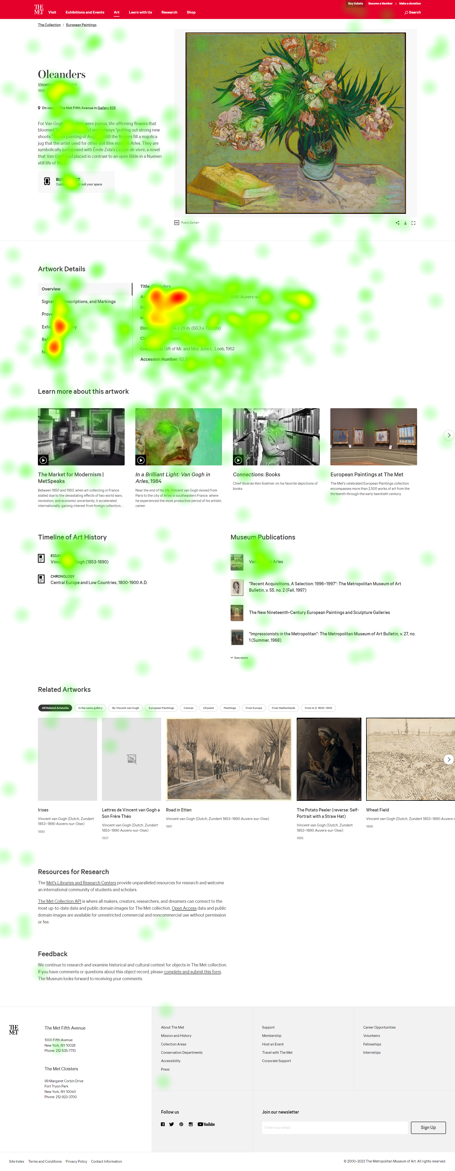
76.3% of visitors exit the collections page after viewing an object (Source: Google Analytics), and data shows that visitors often do not scroll down far enough to see the “related artworks” section available on object pages. This is because the section is located too far down on the page, making it likely to be missed by users.
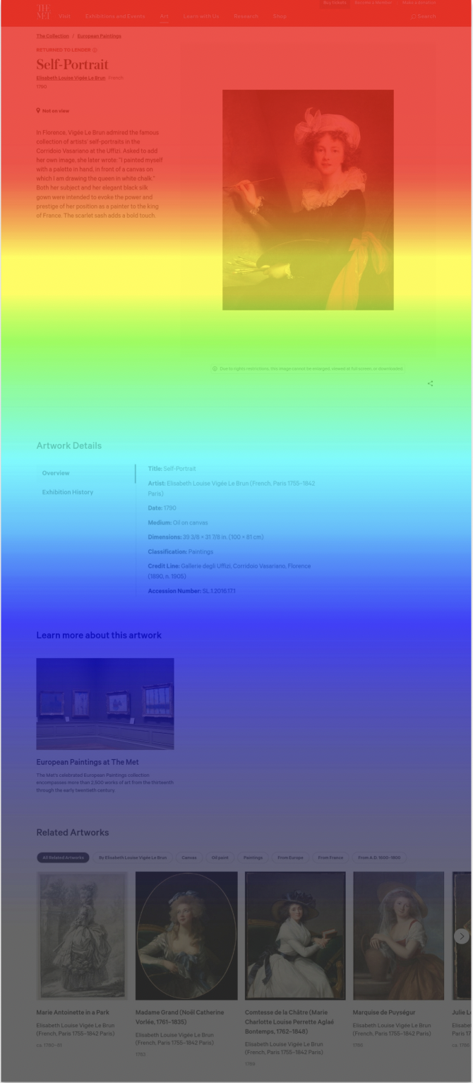

Left: Hotjar scrollmap demonstrating that few users scroll to the bottom of the page where the related artwork section is located (Red = High views, Grey = Low views)
Right: Aggregated heat map of all participants from the eye-tracking study confirming the same observation (Red = High views, Green = Low views, Uncolored = Ignored)


Before
Recommendation
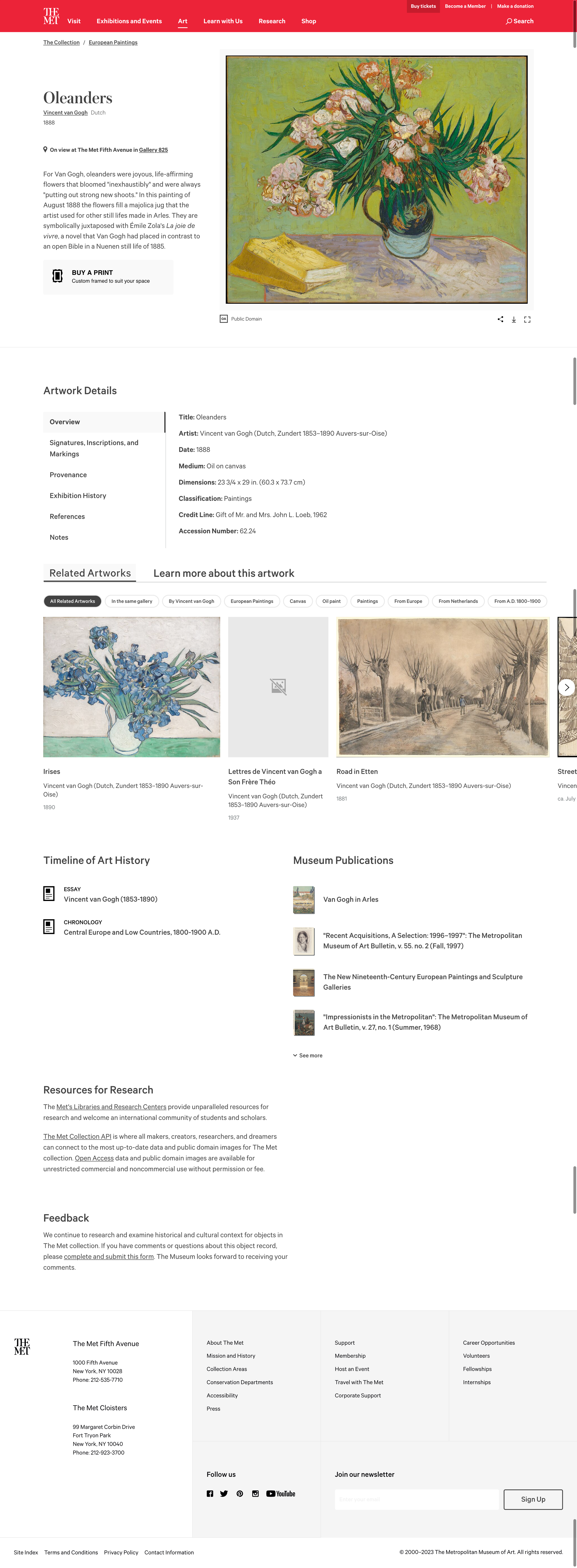
By displaying related artworks more prominently and higher up on the page, it is much more likely to be noticed by users and should therefore decrease the drop-off rate.

After

Filtering options for search results are hindering the search experience
When tasked with finding the oldest Egyptian vase in the collection, only 36% of users correctly identified it despite a 90% confidence rate. This is due to the fact that the option to filter by date/era in the search results is not sorted chronologically as a user would expect.

Search results for “egyptian vase” w/ “Date/Era” dropdown options (Source: metmuseum.org)
Recommendation
Restructuring the filtering options to align with user expectations will enable the user to find object faster and with fewer unintended results. In addition, adding a multi-select option would enable users to browse objects from multiple eras simultaneously, allowing them to search the Collection more efficiently.

‘Provenance’ and ‘Exhibition History’ layouts make it difficult for users to acquire information
Users tasked with finding where an object was exhibited most recently were able to do so with an 83% success rate but with an average completion time of 51 seconds, which can be attributed to the current layout which has no hierarchy of information as well as being sorted in reverse chronological order, defying user expectations of seeing most recent dates at the top and making it more difficult for them to find the information they seek.
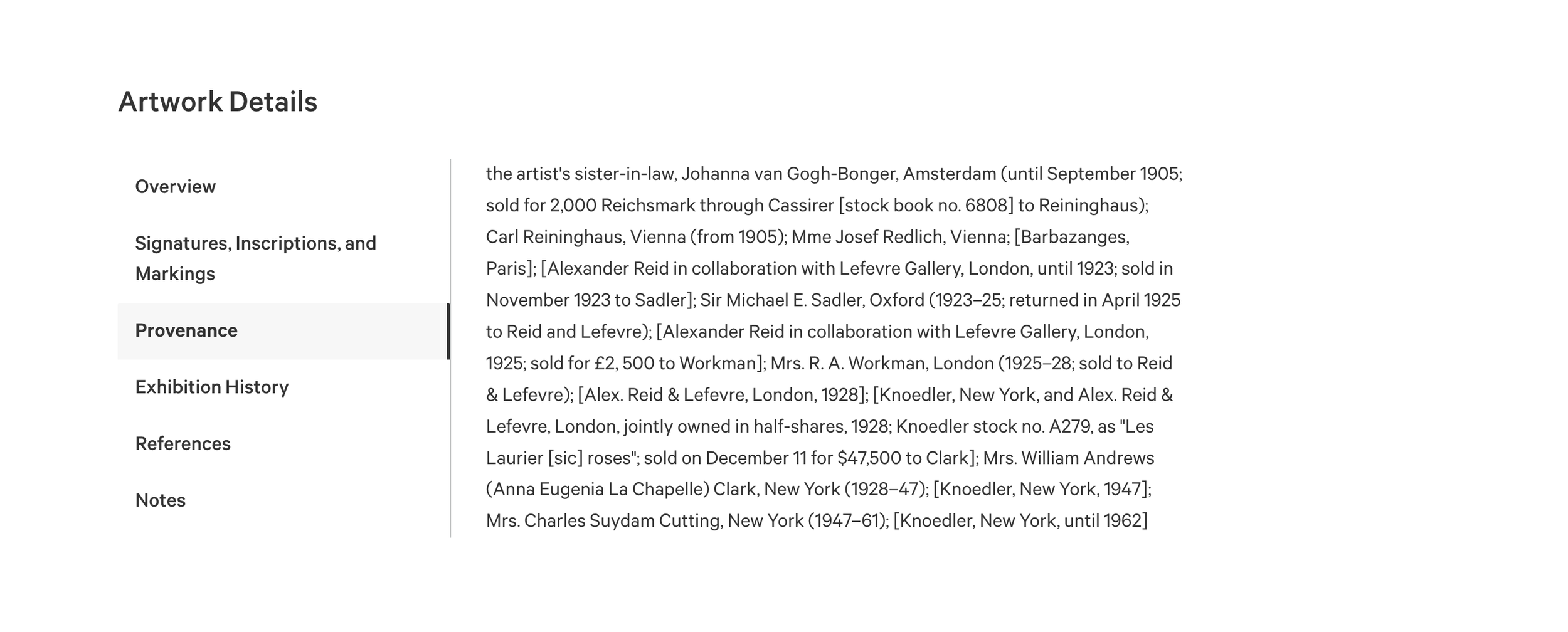
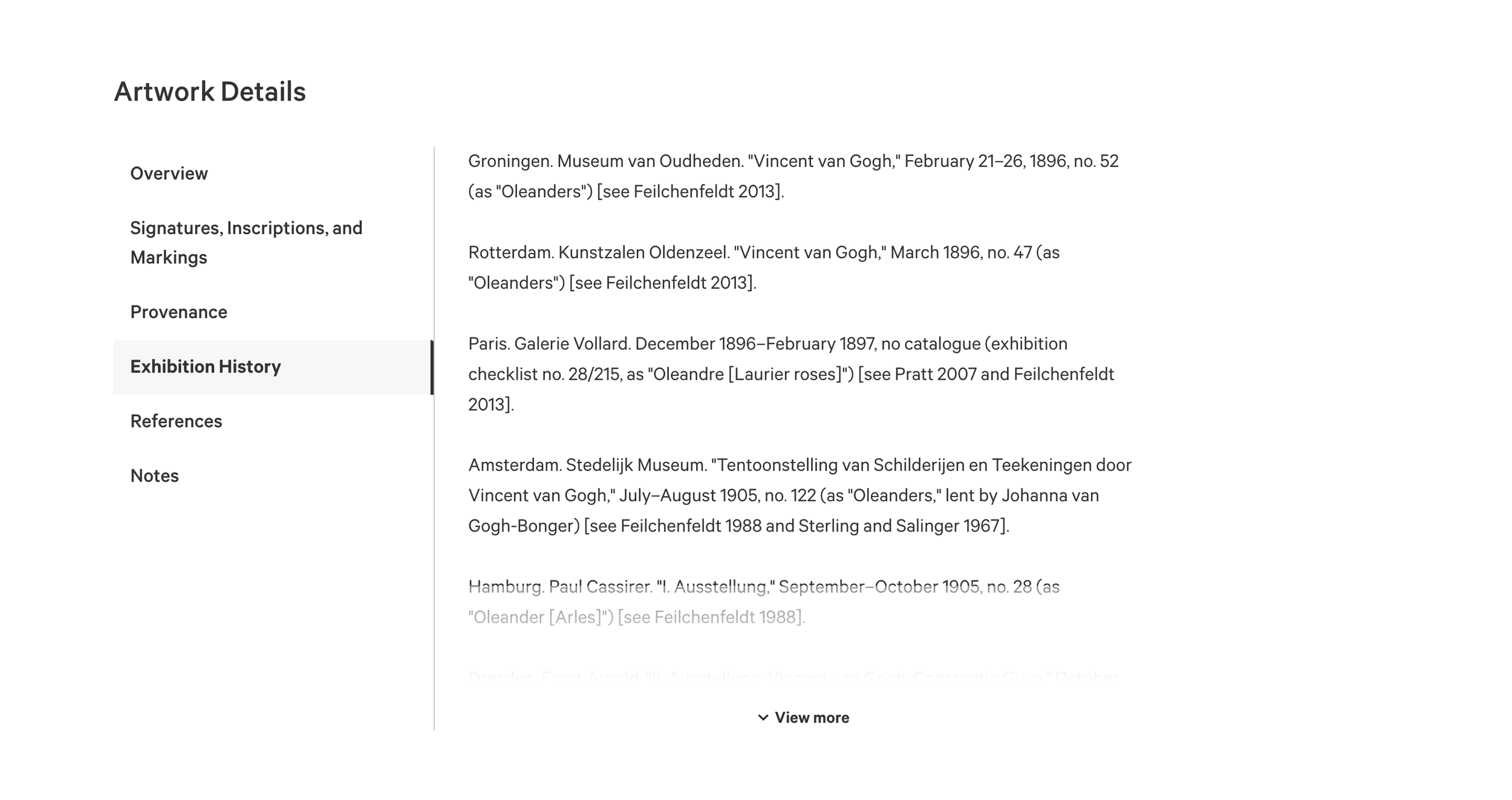
“Provenance” and “Exhibition History” sections for “Oleanders” by Vincent Van Gogh (Source: metmuseum.org)
Recommendation
By redesigning the sections, restructuring the information, and adding sorting options to optimize scanability, users will be able to more quickly and efficiently find the information they are looking for.
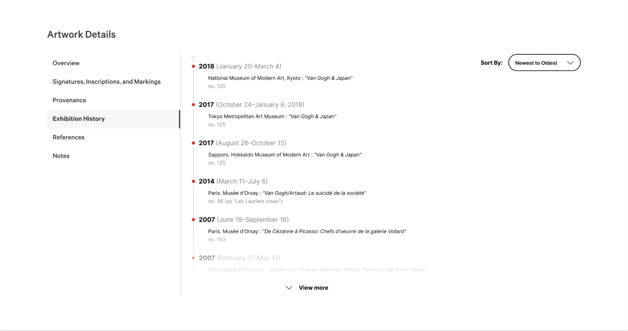
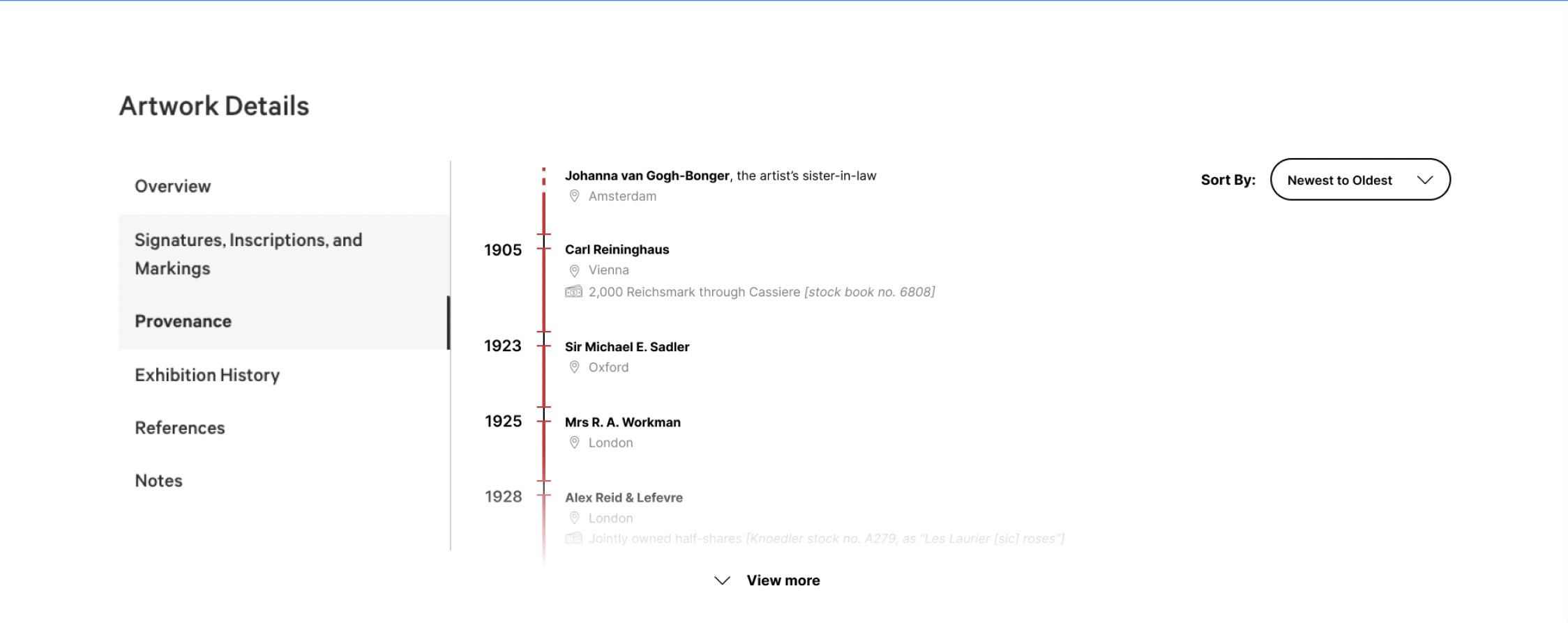
Redesigned “Exhibition History” (top) and “Provenance” (bottom) sections
Next Steps & Conclusion
Next Steps
A/B testing implementing the recommended changes in order to measure effectiveness
Hypothesis: The redesigned “Related Artworks” section should see a measurable decrease in the drop-off rate.
Another round of moderated usability testing of recommended changes in order to measure effectiveness
Hypothesis: The redesigned “Exhibition History” and “Provenance” sections should see a dramatic reduction in average time taken to complete the task of finding a specific piece of information from these sections.
Conclusion

My team presenting our work to the Met Collections team
These findings were presented to the Met Collections team, who received it positively. They seemed excited about our findings and provided excellent feedback.
I was also very impressed with the skill and professionalism of my teammates. Working with them throughout the semester was a great experience and I feel I have learned a lot from them as well.
This project was an excellent learning experience. The opportunity to use eye-tracking software allows me to add an impressive skill to my resume and learning how to perform a behavioral analysis to triangulate data is a skill that I know will carry me far in my career as a UX designer.
