Grassroots Grocery
Attracting volunteers through better UX
My Roles
UX Researcher
Prototype Designer
Teammates
Evelyn Mukherjee
Guillermo Ramirez
Alfredo Gutierrez
Project Duration
6 weeks
Background
Grassroots Grocery is a non-profit organization dedicated to providing fresh groceries to families in low-income communities in New York City.
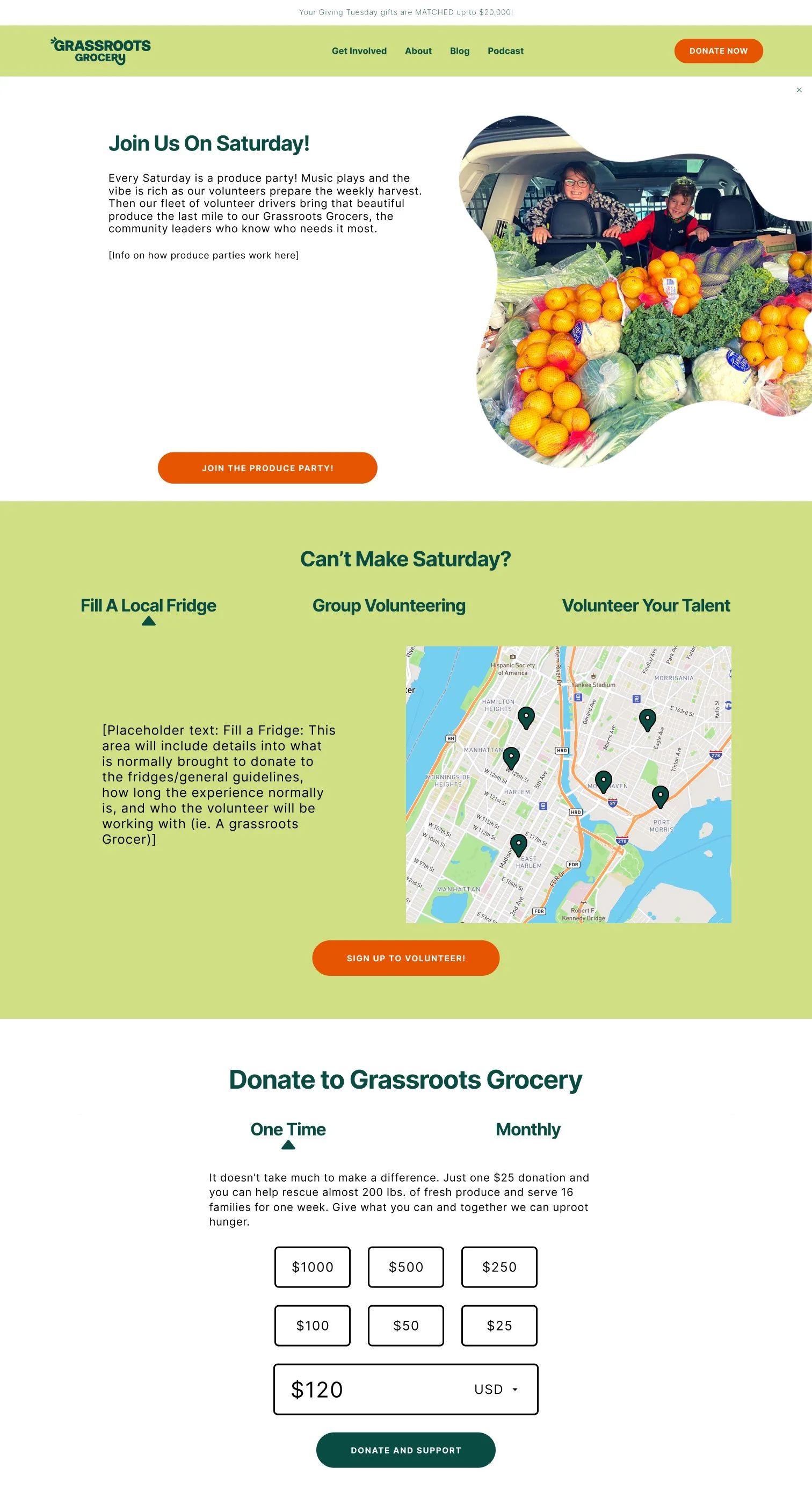
They rely on volunteers to both pack the groceries, drive them to be delivered and distributed, and keep community fridges stocked through their “Fill a Fridge” program. A large part of their funding also comes from donations.
As such, Grassroots Grocery is looking to attract more volunteers through their website, as well as ensure that the website communicates their core values to visitors.
Task
Redesign website features to increase the number of volunteer sign-ups.
Ensure that Grassroots Grocery core values are being communicated effectively.
User Research
Participants were recruited and data was gathered through two methods:
Participant Screening Survey
Moderated Usability Testing
Participant Screening Survey
First step was to find appropriate participants for moderated usability testing, which was done via an 8 question participant screening questionnaire. The questionnaire filtered participants based on their location (Must be tri-state area residents), and grouped them according to their level of volunteering experience.
Participants are sorted into categories to account for the needs of both first-time and experienced volunteers in order to design features to serve both target groups (All participants were asked to do the same tasks in usability testing).
Participants were sorted into 3 categories:
Have interest in volunteering but have never volunteered (4 participants)
Have volunteering experience but have never volunteered with Grassroots Grocery (2 participants)
Have volunteered with Grassroots Grocery in the past (2 participants)
Moderated Usability Testing
Total number of participants: 8
Moderated usability tests were carried out by having participants get on a video call with one of the team members, who acted as moderators, and share their screens as they performed tasks. Moderators closely observed participants and took notes on their actions and asked questions to gain a deeper understanding on the thought process of potential volunteers.
Usability testing was divided into three parts:
Pre-test: Participants were asked questions regarding their backgrounds (age, occupation). Category 1 volunteers were asked to talk about what interests them about volunteering, and category 2 and 3 were asked to talk about their volunteering experience.
Main test: Participants were asked to complete a series of tasks centered around exploring volunteering opportunities while talking through them and giving their opinion about each task after completion.
Post test: Participants were asked which features they liked most, which task they struggled most with, and if they believe the website accurately reflects Grassroots Groceries’ values as an organization after having learned more about them.
Notes and observations from all usability tests performed were compiled and analyzed to uncover any overarching usability issues from which to draw recommendations for improvement.
Results: Usability Issues & Design Recommendations
Through usability testing, we uncovered 5 usability issues that need to be addressed to enhance the volunteer experience. This section of the case study will highlight each usability issue and provide recommendations on how to fix them, along with a visual mockup of how they could be implemented on the website.
Issue 1: Browsing Volunteer Opportunities Takes Too Long
Participants took a long time to uncover all the available volunteering opportunities.
This can lead to users abandoning their task out of frustration or potential volunteers missing opportunities they may have otherwise been interested in.

Recommendation
Single page with all volunteer opportunities clearly listed, accessed by clicking “get involved” in the nav bar.
This allows potential volunteers to quickly gain an overview of all available volunteering opportunities with minimum effort.

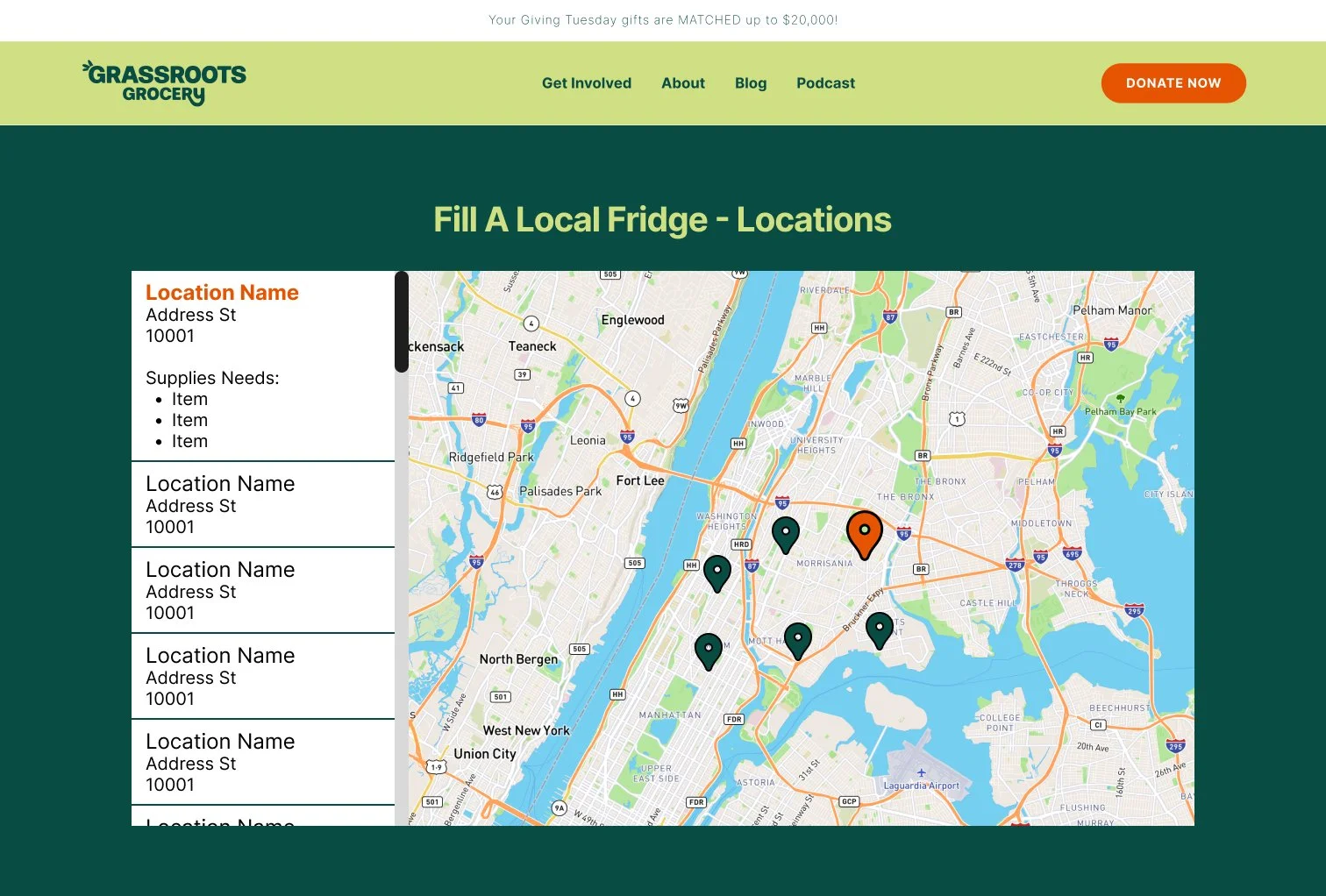
Issue: “Fill A Fridge” Lacks Detail
The “Fill a Fridge” volunteer option, while initially popular with participants, held little to no follow through due to there being no information about where the fridges were located or what sort of donations are needed.
Lack of information caused test participants to lose interest due to confusion on how they can participate.
Recommendation
An interactive map of all fridge locations in the city with the status of each fridge visible.
Potential volunteers will have a much clearer understanding of how community fridges work making it more likely that they will volunteer.
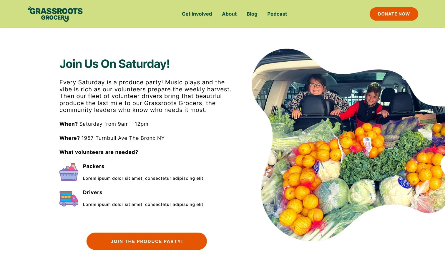
Issue 3: Lack of Logistical Info for Events
Limited logistical information on the various volunteering opportunities (ie How long events take, what kind of work they can expect to do).
One of the main concerns for potential volunteers is scheduling, so being unable to make time to volunteer due to lack of information was an obstacle.


Recommendation
Clearly laid out information sections for each one of the volunteering opportunities to set the expectations of potential volunteers so they may better plan to volunteer their time, making it more likely they will volunteer.
Issue 4: Info on Member of GG Too Spread Out
Information on the various groups who make up Grassroots Grocery (GG Team, grocers, and food justice committee) is spread out across multiple web pages, creating an unnecessary obstacle for potential volunteers who want to learn more about the organization.
Many potential volunteers, particularly those with extensive volunteering experience, are socially conscientious and like to inform themselves on the organizations they volunteer with.
Recommendation
A single page with all the groups who make up GG with descriptions on what each group does and how they work together.
This single page layout would allow potential volunteers to more easily inform themselves about Grassroots Grocery, while also reinforcing the community-based aspect of GG by showing all its members together .

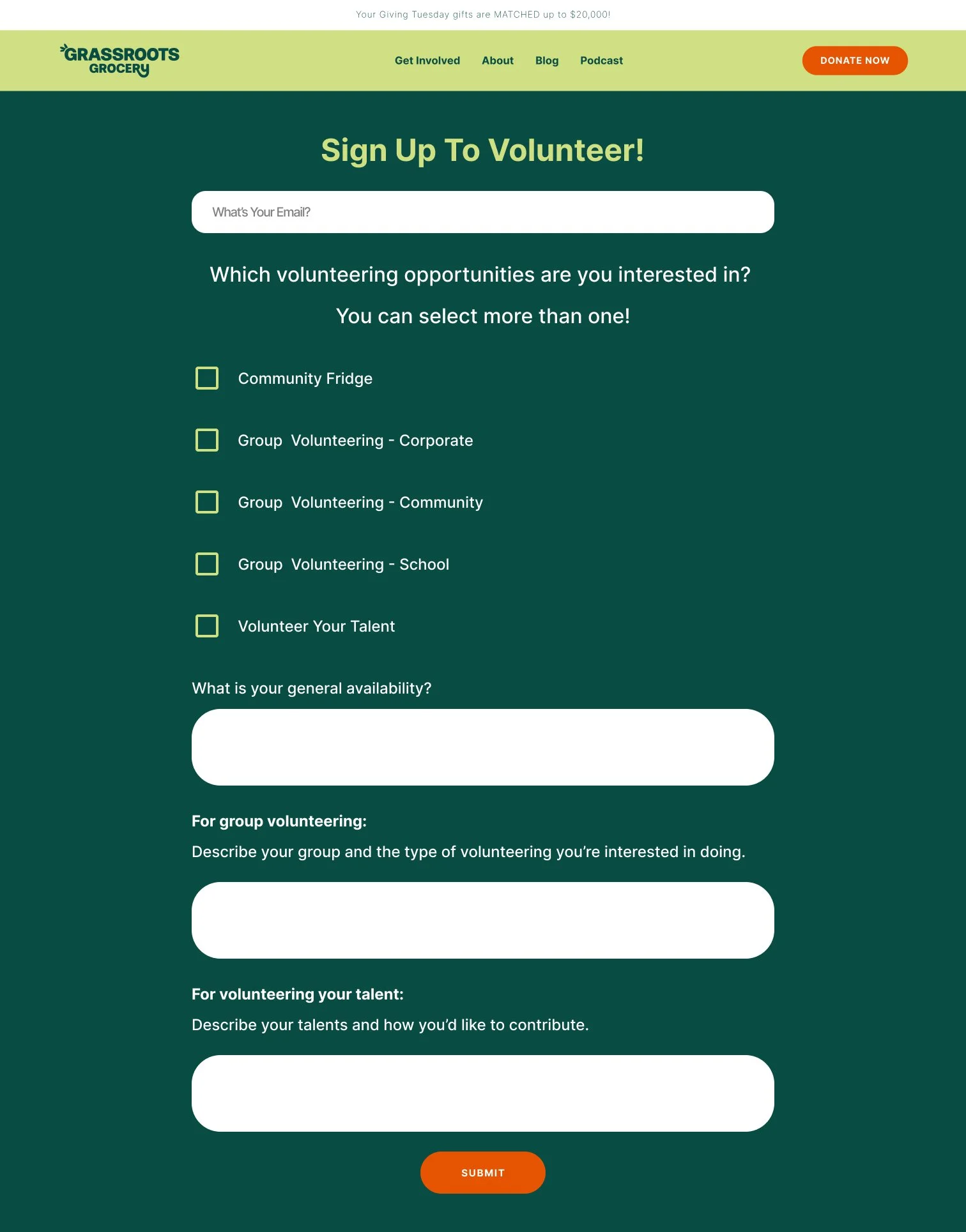
Issue 5: Too Many Sign-Up Forms
Multiple different volunteer sign-up forms across the webpage make signing up to volunteer a confusing and potentially frustrating experience, which makes it more likely that a potential volunteer will abandon their task.
Recommendation
A single, consolidated sign-up form which can be used for all volunteer experiences across the page.
A clear, simple sign-up form makes for a more streamlined experience, making it less likely that a potential volunteer will abandon their task


Next Steps & Conclusion
Next Steps
Additional usability testing on the proposed recommendations would be necessary to verify is they are effective in accomplishing their task of drawing in more volunteers.
Conclusion
This project was a great experience not only in developing my research skills but also in dealing with a real-life client and in managing as a team. I have no doubt that all the skills I used and experienced I gained will serve me well throughout my carreer as a UX designer.
