Muni: Conceptual Design Sprint
Improving the Muni Experience to Increase Ridership
My Roles
UX Designer
UX Researcher
UI Designer
Teammates
Paola Padilla
Cynthia Bach
Project Duration
2 weeks
The Challenge
SFMTA wants to find a way to increase Muni ridership during off-peak hours. The question was: How can we make Muni a more appealing option, particularly for riders who may have other transportation options available to them?
Research
In order to find a solution we needed to find what are the reasons why potential riders are not choosing Muni. 2 research methods were used for this:
Surveys to gather large amounts of data regarding the opinions and habits of potential riders.
User interviews to gather detailed qualitative data and deep insights from people who frequently ride Muni.
Talking To Riders
Six frequent Muni riders were interviewed to learn more about their experiences and to give them a chance to voice any frustrations and concerns to learn what’s really important to Muni riders.
“Figuring out how to purchase tickets was like reading a foreign language.”
— Anish M.
“Constant inaccurate train arrival times that leave me waiting on the platform for an extended period of time.”
— Isabella H.
“It’s not a great experience to ride it as it’s usually dirty.”
— Madeleine P.
Confusion, Delays, & Concerns
Our research revealed that there are 3 common concerns about riding Muni:
Unpredictable delays
Difficulty purchasing tickets .
Safety & cleanliness.
These concerns all contribute to a rider’s decision to not choose to take Muni when another transportation option may be available to them.
Hypothesis
By taking a multi-faceted approach to the problem by redesigning the Muni app to address riders’ main concerns (Delays, ticket purchasing, and safety), the overall quality of the Muni experience will improve and therefore encourage potential riders to be more likely to choose Muni during off-peak hours.
Test, Evaluate, Improve, Repeat
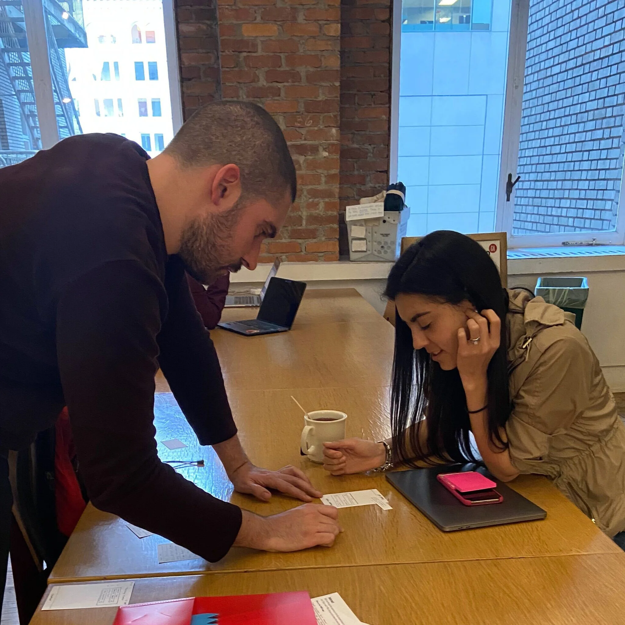
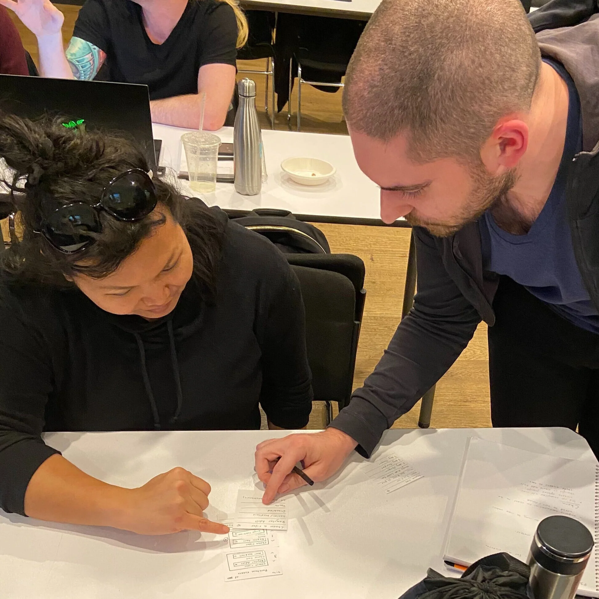
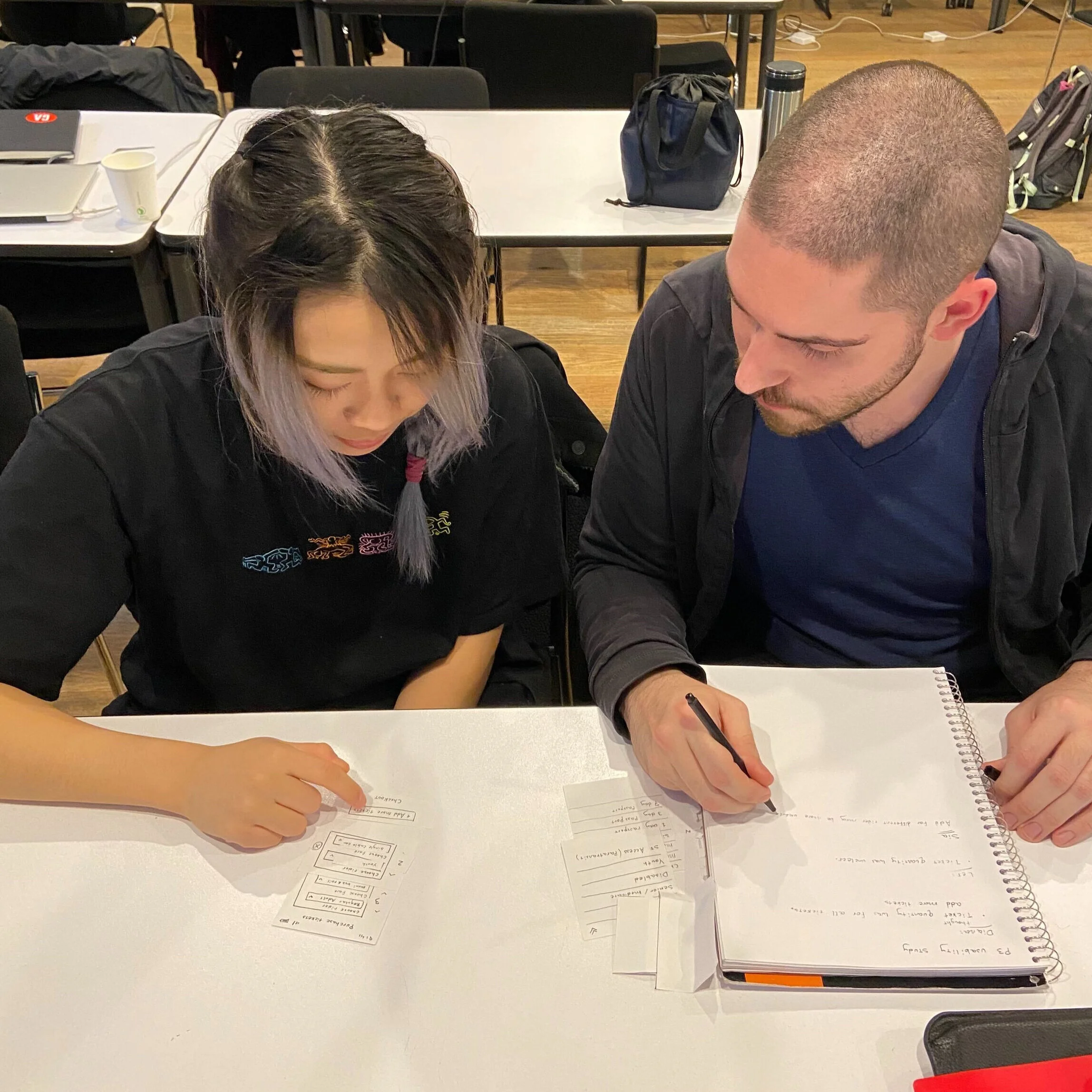
To refine our design, feedback from usability tests was needed to find out what works and what needs to be changed. Paper prototypes were used to generate feedback early in the process and moved on to low-fidelity digital prototypes as we moved along the design process.
Several usability tests were performed to uncover any opportunities to improve the design. During each test we noted at which points the user encountered difficulty and also interviewed them afterwards in order to hear their thoughts & opinions and obtain further feedback.
The New Muni App
The Muni app was redesigned with the rider in mind to include features and functions that will make riding Muni simpler and safer for everyone.
Real Time GPS Tracking
Unpredictable delays often mean that riders end up waiting at stops much longer than expected or missing their bus altogether and arrive to their destinations much later than expected. This can make taking Muni an incredibly frustrating experience.
A real-time tracking feature will enable riders to receive updates on the location of their bus in real-time (Similar to Uber) and so can more easily plan when to head out and know how long to expect to wait. Real-time tracking enables riders to get an accurate estimate of the ETA to their destination, making riding Muni a much smoother experience
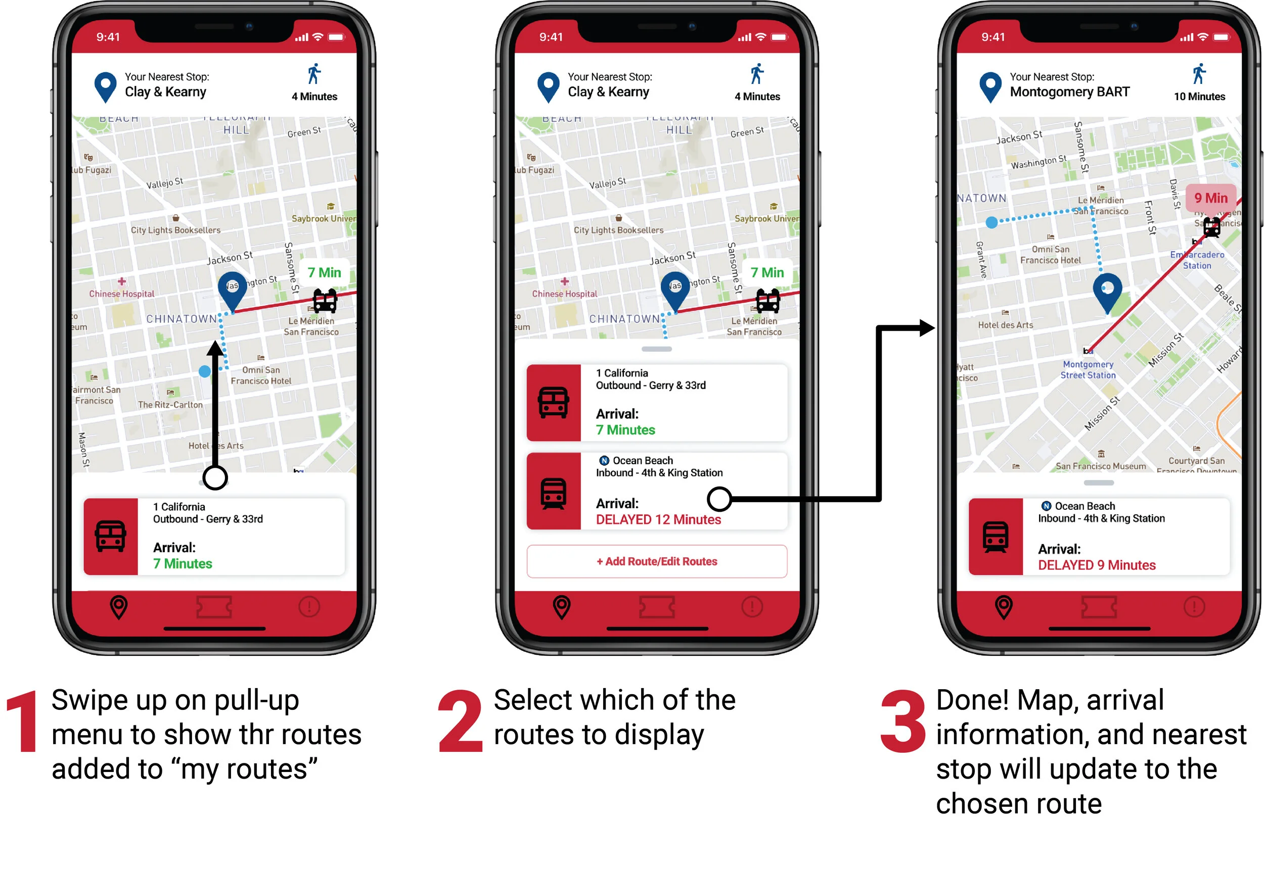
Customizing Your Routes
Choosing Between Routes
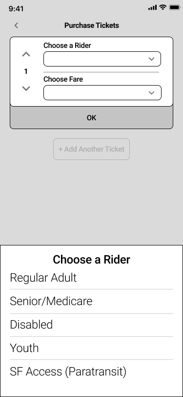
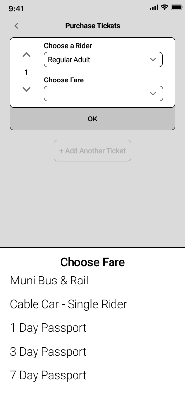
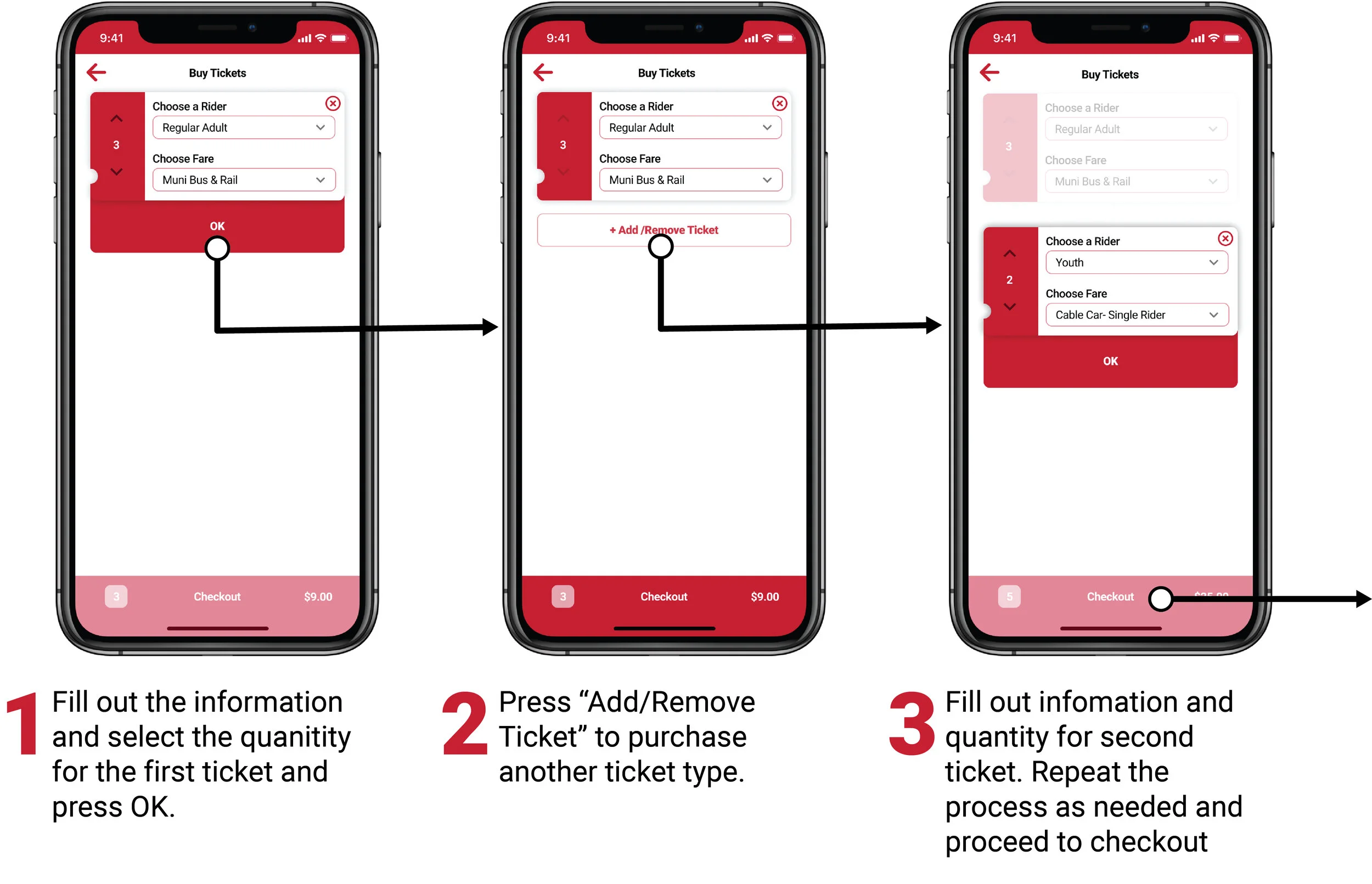
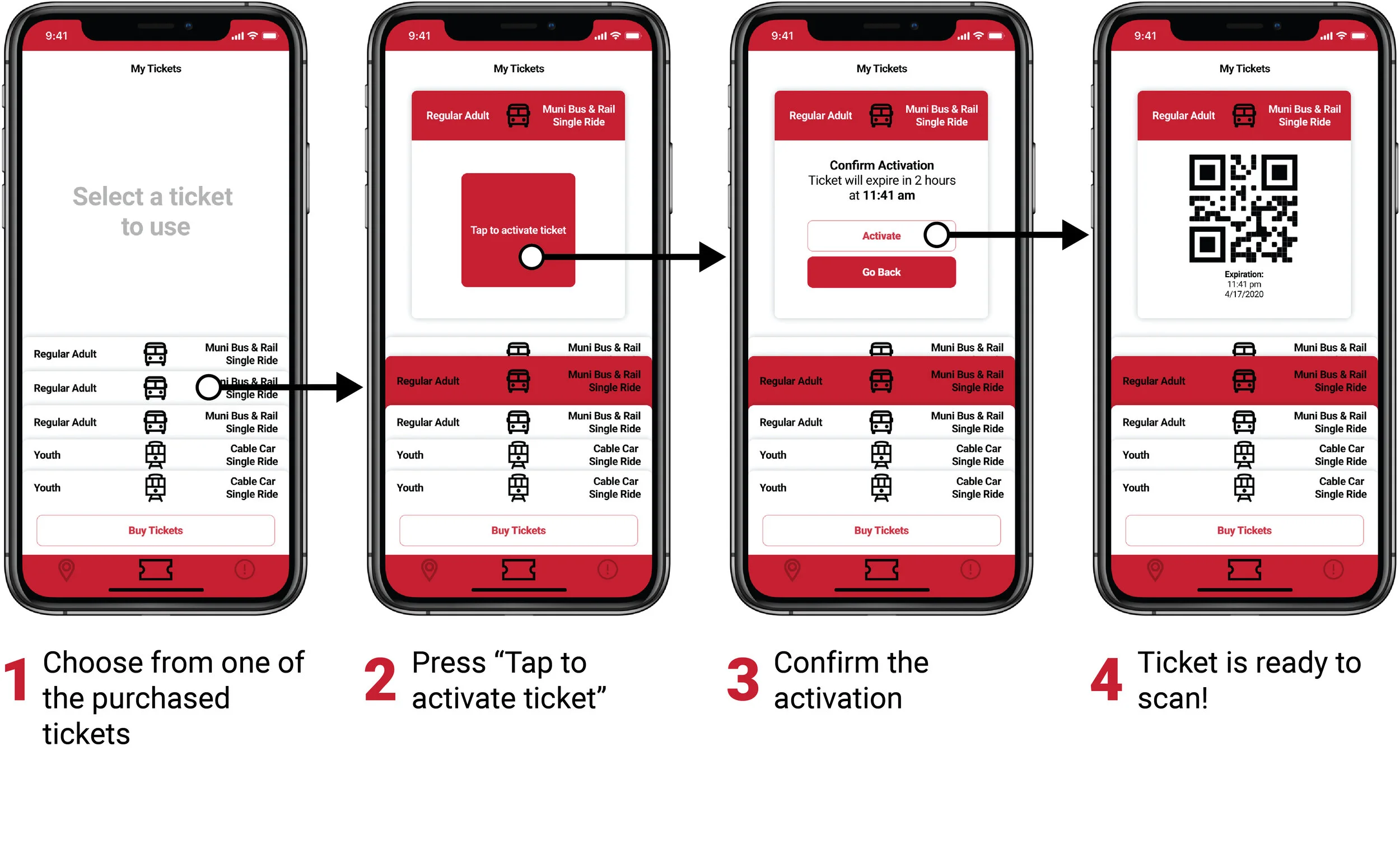
Ticketing Made Easy
In order to buy two tickets for two separate rider (for example one adult & one youth), it was necessary for the user to move through seven separate screens.
The new app design has reduced this number to one.
By making purchasing and using Muni tickets simpler and faster, the risk of the user abandoning the process is reduced and removes an obstacle which may have prevented a potential rider from riding Muni.
Before the redesign
Purchasing Tickets
Activating Tickets
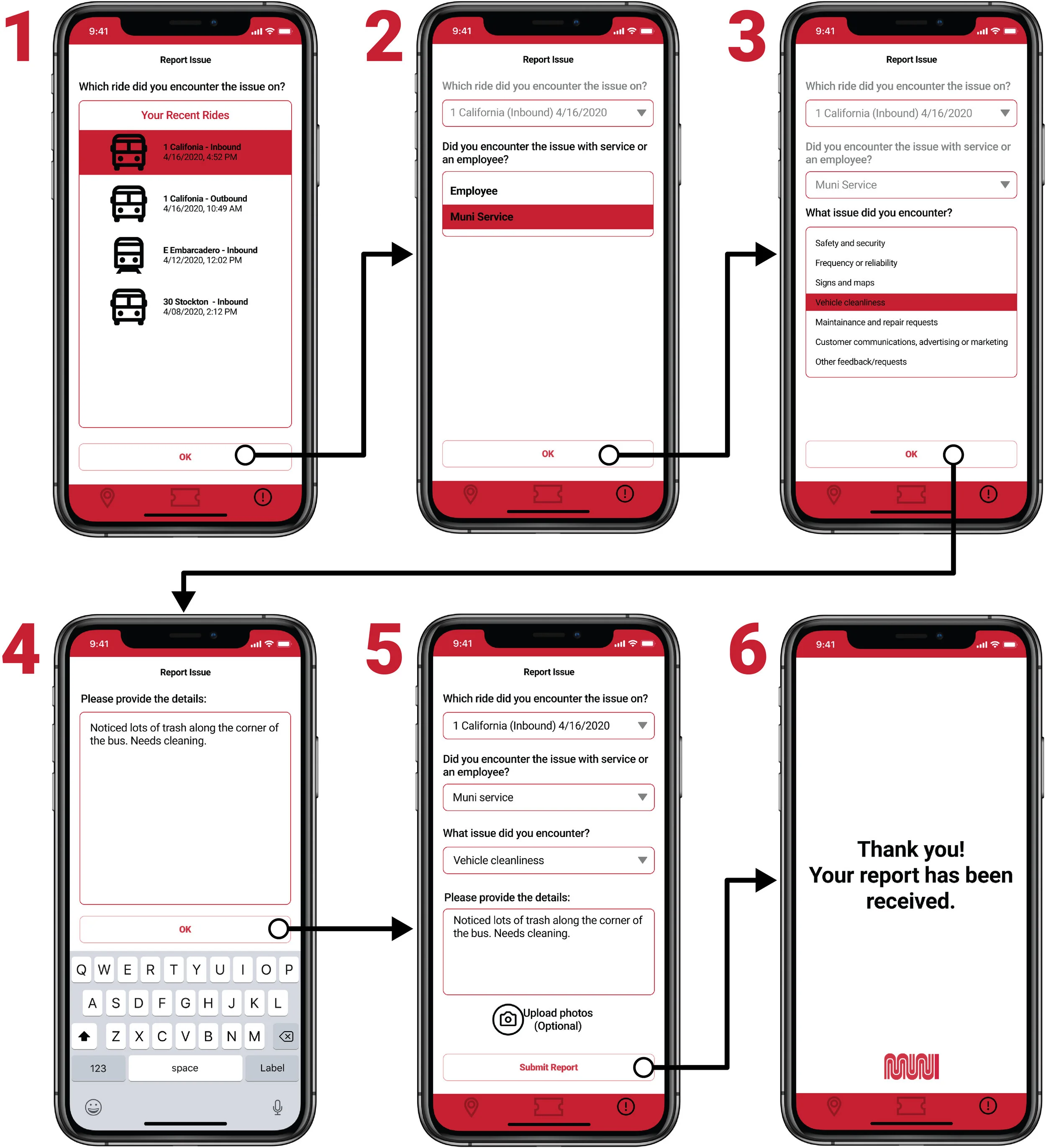
Reporting Service Issues
Safety while riding and cleanliness of the vehicles were two concerns frequently mentioned by riders. The improved reporting function enables riders to quickly and easily report any issues they encounter during the course of their ride.
The user simply needs to fill out a simple for and upload a picture if necessary. The feedback will help Muni pinpoint opportunities to improve their service, which benefits the rider and gives them an opportunity to have their voice be heard.
Simply follow the prompts to submit a report:
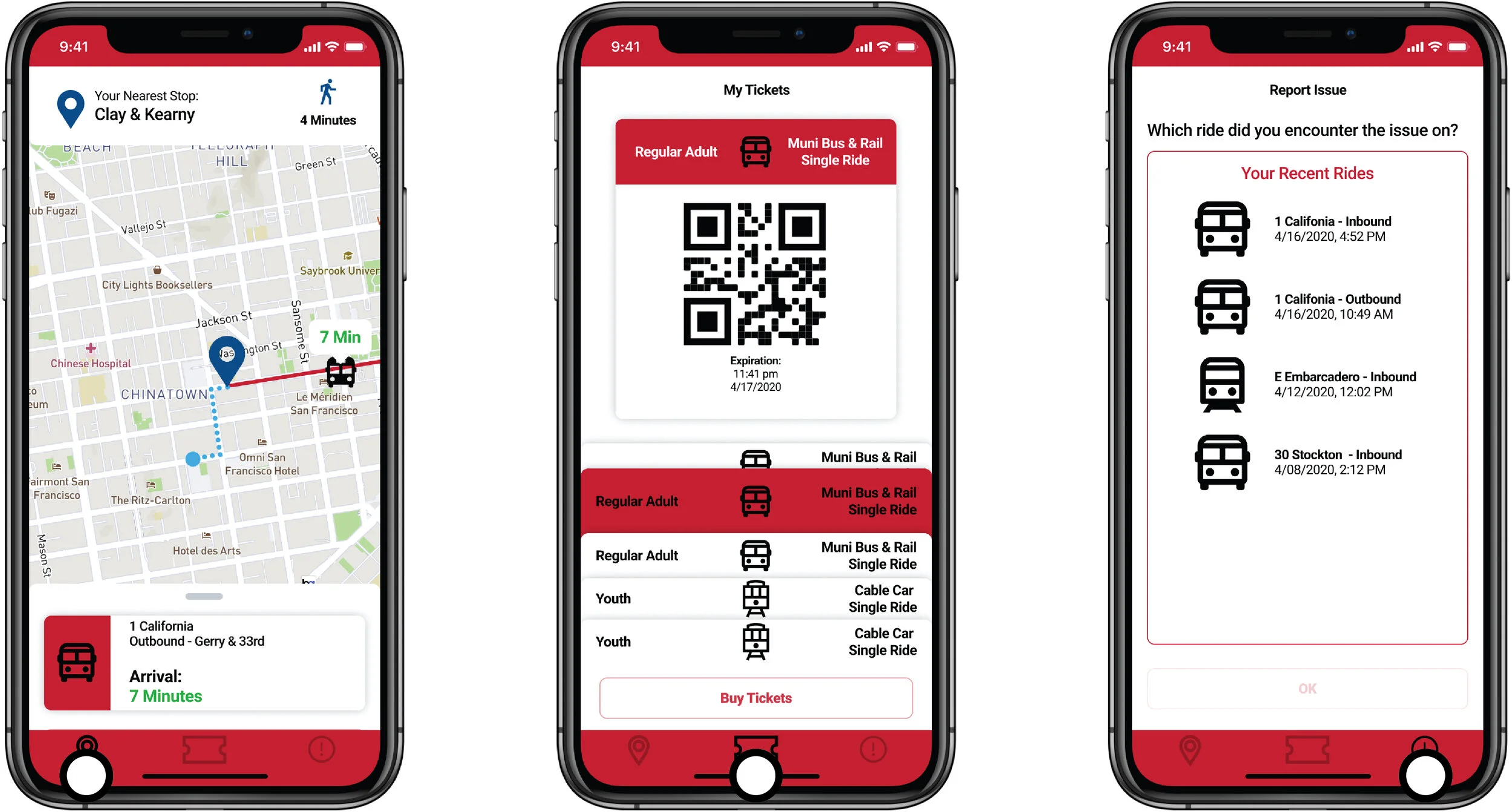
Switching Between the Features
The bottom bar enables users to quickly switch between the various features in an instant. A user could be tracking their bus while walking to the bus stop and then immediately have their ticket ready for scanning to board the bus, making for a smooth Muni experience.
Key Takeaways & Next Steps
This was a fun challenge and everyone on the team had a lot of fun working on it! I am particularly please with the way that the UI turned out. Even though this is just a conceptual design challenge, I would very much like to see this app undergo usability testing in the real world, as I believe it could truly be effective at increasinf Muni ridership.


