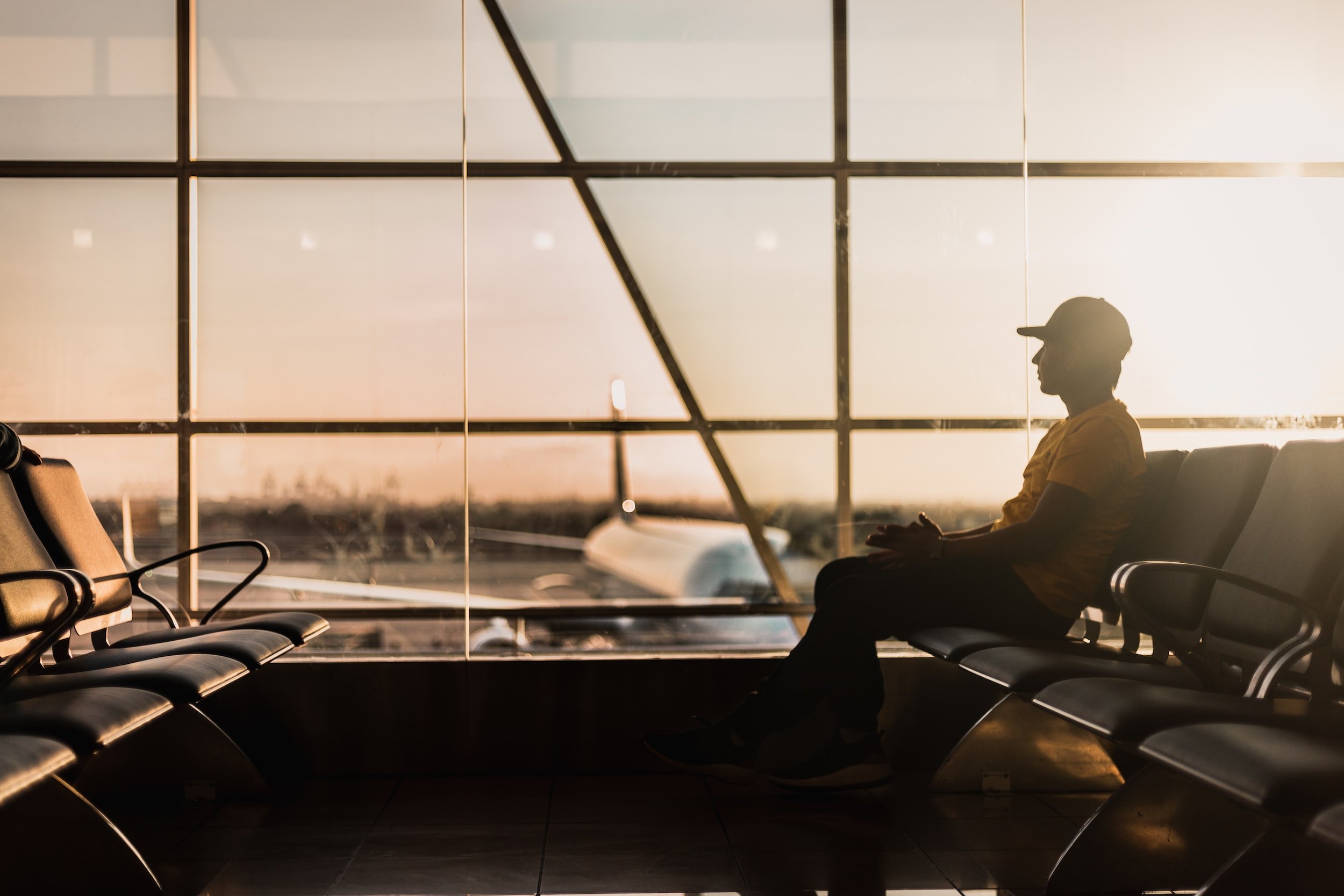
AMERICAN AIRLINES DESIGN CHALLENGE
This design challenge was given to me as part of the final round of interviews for a UX designer role for American Airlines at their HQ in Dallas, TX and was was presented to the UX leads.
Project Duration
1 Week
THE CHALLENGE
UNEXPECTED CIRCUMSTANCES
You and a friend are traveling from LA to NYC via Chicago. When you land at ORD airport, you learn that American has canceled your next flight due to a snowstorm in New York. Create the flow that takes the user from the email to where they choose a hotel, get meal vouchers and confirm their selections.
ASSUMPTIONS
Users will most likely be completing the process on mobile, hence mobile-focused approach
Process should be browser-based, as not all users can be expected to have a specific app installed on their phones
RESEARCH
DEVELOPING EMPATHY FOR THE USER
Before getting to work on the final design, I employed a variety of research methods to better understand what a user may be experience during a flight cancellation event and explore what type of issues they may run into.
Questions to better understand the user and guide the design process:
How might the user be feeling at that moment?
How can we make the best of an unfortunate experience?
What are the user’s goals?
What are obstacles that may further inconvenience the user?
How can the process be made as fast and painless as possible for the user?
IMMERSIVE RESEARCH
To gain a deeper understanding of the situation a user might find themselves in, I went to my local airport (with a “suitcase“) in order to walk in the user’s shoes and uncover any potential pain points.
This led me to two insights: that the navigation should be simple as possible, as it is likely that users will be carrying luggage, and that it can be difficult to navigate an unfamiliar airport and find the hotel shuttles, which I believe the app can help with.
USER INTERVIEWS
SPEAKING TO TRAVELERS
I interviewed 4 people with travel experience and a flight attendant to obtain qualitative data
All 4 travelers agreed that proximity to airport was the number 1 criteria for choosing a hotel to stay in during a layover.
According to the flight attendant, the most common complaint among passengers experiencing delays is special events (weddings, funerals, etc) which often leads to stress and frustration.
PERSONA
TRAVELER CONCEPTUALIZATION
Using the prompt received and data gathered from my research, I constructed the following persona design the final product for:
Two friends on same reservation
Comfortable using mobile phone
Prefer separate hotel rooms
Unfamiliar with Chicago O’Hare layout
Prioritize proximity to airport and convenience of getting to/from hotel when making hotel choice
How they may be feeling:
Irritated
Stressed
Anxious
Impatient
Tired
DESIGN GOALS
Create a browser-based application which allows a user to select a hotel room for the night and receive a meal voucher using as few screens as possible and expediting the process of getting them to their hotel rooms as quickly as possible.

Open link in email
Choose how many rooms you’ll need based on party size
Browse room choices and make a selection
Receive confirmation
RECEIVE MEAL VOUCHER
AIRPORT NAVIGATION

From the room confirmation screen, receive directions to shuttle of the chosen hotel room

Email includes a link to the meal voucher, which can be saved for later use
Reflection & Takeaway
This was a fun design challenge and I really enjoyed meeting the designers at American Airlines who were kind enough to offer me feedback on my work! As with most of my designs, I would be interested in testing this in a real world setting and seeing its effectiveness, or what changes need to be made.


