Abercrombie & Fitch
Website Information Architecture Redesign
My Roles
UX Researcher
UI Designer
Prototype Builder
Teammates
Anyelina Wu
Tharani Prabu
Project Duration
4 weeks
Background
For our information architecture class, I along with two other teammates were assigned the task of redesigning the information architecture of the Abercrombie & Fitch website. Throughout the course of the semester we learned about various IA concepts and user research methods, which we then applied to this project.
This project will focus on the women’s category due to it being the largest, as well as that the other categories have similar but fewer subsections.
Improve the information architecture of the Abercrombie & Fitch website to make it easier for users to navigate and find the items they are looking for.

Task
User Research
Data for this project was uncovered primarily through three user research methods:
Open Cards Sort
Moderated Usability Testing
Tree Testing
Total Number of Participants: 16 (Including 3 moderated)
Participants were asked to sort 38 different items into categories however they saw fit. The categories are created and named by the users themselves.
This method enables us to get a picture of a user’s mental model, or how they would expect to see items on the A&F website grouped. This way, we can restructure the navigation so that items are grouped in ways a typical user may expect, making it easier for them to navigate to what they are looking for.
Moderated testing allows for further insight into a user’s thought process by asking them questions after they complete their tasks.
Open Card Sort
Results & Key Takeaways
Users tend to group clothing by function >> “Warm Layers” category created
New categories created by users:
“Intimates & Sleepwear” >> Separate “Underwear” & “Sleepwear” categories
Total Number of Participants: 8 (Incl. 6 moderated)
Tree testing was used to verify the accuracy of the results from the open card sort by having participants complete 9 tasks which involved searching for a specific clothing type given a scenario, phrasing the tasks in an open-ended way which avoid giving the participant the answer. The categories are based on the results of the previous open card sort.
This is an effective way of testing the information architecture of a website because it replicates how users typically use a website: They already know generally what they want which is why they arrived in the first place, all they have to do is navigate to it.
Moderated testing allows for further insight into a user’s thought process by asking them questions after they complete their tasks.
Tree Testing
Results & Key Takeaways
The new information architecture achieved the following results:
86% of participants arrived at the correct category
79% of participants arrived at the correct category on their first try without backtracking.
Failures can be attributed to the fact that certain items could potentially be placed in multiple categories, such as sweater dresses which can go under “dresses” or “warm layers”.
Other failures came from users interpreting items in unexpected ways, such as searching for formal wear in the “wedding” category. Due to my limited knowledge of women’s clothing I would not have anticipated this.
Total Number of Participants: 6 (All moderated)
After confirming the effectiveness of the new information architecture through tree testing, it was time to test the new IA in the context of the webpage. To this end I built a clickable prototype (Links to Desktop & Mobile versions) on Figma replicating the current layout of the A&F website but with our newly developed IA for use in usability testing.
Users have a tendency to perceive the usability of an interface differently based on their design, which is why it is important to test navigation structures in context.
Moderated Usability Testing
Results & Key Takeaways
No significant usability issues were uncovered during testing, marking our new information architecture as a success.


Final Results & Next Steps
Final Results
Changes made from original A&F navigation scheme:
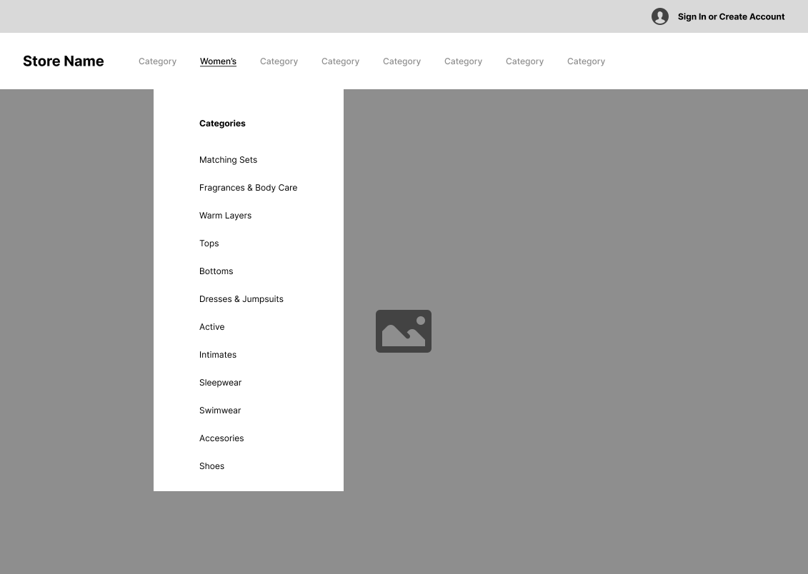
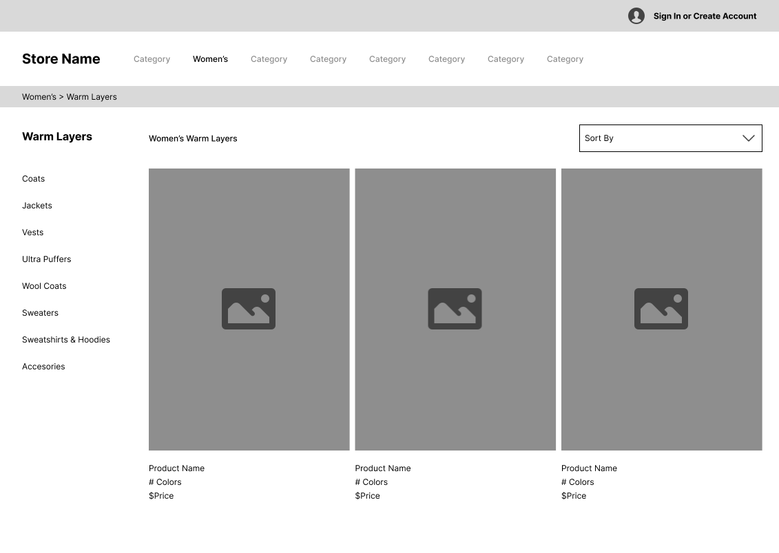
Add “Warm Layers” category
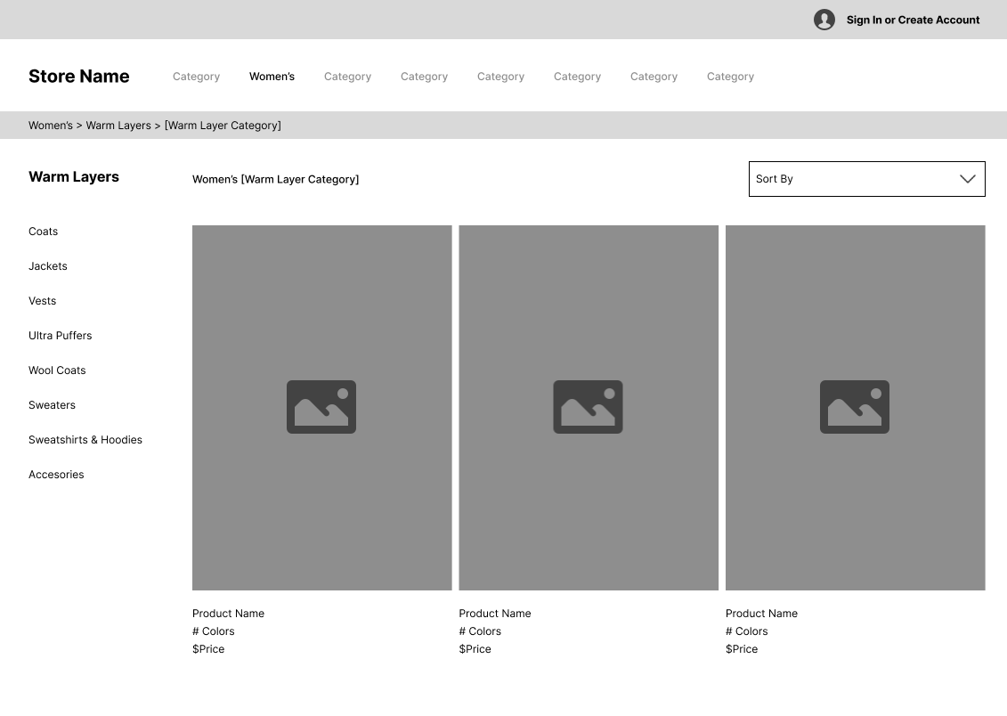
From Matching Sets, make “Active Sets” “Sleep & Lounge Sets” “Swim Sets” and “Fashion Sets” subcategories within “Active” “Sleepwear” “Swimwear” “Tops” “Bottoms”, respectively
Include “Sweater Dresses” in “Dresses” and “Warm Layers”
Separate “Intimates and Sleepwear” into “Intimates” and “Sleepwear”
Next Steps
Carrying out the same tests (card sorting, tree testing, and usability testing) on the men’s and children’s sections to determine if any improvement could be made that differ from those applied to the women’s category.
Performing a tree test using the current product categories to measure the level of improvement between the original IA structure vs our new one.
Conclusion
This project was an incredibly informative education experience. Learning about the various research methods we used and seeing them used in context allowed me to gain a deep understanding and appreciation for them. I know the research skills I gained will serve me all throughout my career in UX.
