Upwork: Client Project
Redesigning the Upwork Onboarding Process to Meet Shifting Business Goals
My Roles
Researcher
Prototype Designer
UX Designer
Teammates
Paola Padilla
Let Roces
Project Duration
3 weeks
Background
Upwork is known as a website through which anyone can cheaply hire freelancers for quick projects.
However, Upwork has recently begun shifting their business model away from freelance work and focusing on clients from mid-to-large size organizations looking for teams to work on longer-term projects.
The Challenge
How can we make the process of hiring teams through Upwork as simple and transparent as possible for clients at mid-to-large companies who have little experience hiring teams and low-domain knowledge of the type of work they are hiring for?
Phase 1: Research
Hearing From the Experts
In order to find a direction for a design, it was important that we speak to potential clients in order to find out what were their opinions regarding hiring and freelancers, and what they look for when they hire talent for projects. We interviewed 6 professionals from a diversity of industries including tech, medical, and entertainment.
Key Takeaways
Outside talent is often hired based on recommendations from colleagues or other professional connections, i.e. credentials are the most important factor when hiring.
The term “freelancer” has the connotation of fast, cheap work and not the type of worker one would hire for longer term complex projects.
Onboarding Process: Heuristic Analysis
According to the client briefing, the current Upwork onboarding process was encountering a high bounce rate among users. To find out why, we performed a heuristic analysis of the onboarding to identify potential user pain points. We evaluated the following:
Is it easy understand?
Is it easy to scan?
Is there minimal text/information presented?
Is the terminology clear and jargon, if present, explained?
Is there help available on every page?
Key Takeaways
Throughout the onboarding process there are lots of technical terms and jargon, which are likely to be confusing for our target user.
There is no help available to the user which could clarify unfamiliar terms or aid with making a decision.
The onboarding process prompts users to create an account early on in the process, creating a barrier to entry.
Hypothesis
Improving the current onboarding process by providing educational cues and recommendations based on the user’s project and by also simplifying the language and removing unnecessary jargon will enable the user to more efficiently navigate the onboarding process and see it through to the last step.
Phase 2: Ideation
The next step was to create design concepts based on our hypothesis. We presented 3 concepts to the client in order to better focus our design.
Option to change the onboarding process based on level of hiring experience. More experienced users can remove the informative sections.
Upwork recommends pre-built teams based on user’s needs.
OUTCOMES BASED ON CLIENT FEEDBACK
Pre-built teams incorporated in to final concept.

CONCEPT 1
CONCEPT 2
Informing the user on why having a team is beneficial as opposed to one single worker.
Recommending teams who have worked together in the past.
Enabling users to skip filling in details which are yet to be decided, such as budget.
OUTCOME BASED ON CLIENT FEEDBACK
User education on necessity of teams incorporated and pre-assembled teams into final concept.
CONCEPT 3
Landing page provides as much information as possible (Typical cost, time frame, process, etc.)
Low commitment; Account creation not necessary until user is ready to send/receive proposals.
Overview of available talent with qualifications and past work.

OUTCOME BASED ON CLIENT FEEDBACK
Concept 3 incorporated into final concept.
Final Concept
LINK TO CLICKABLE PROTOTYPE
Hiring a Team
With information provided by the user, Upwork will recommend a team which best fits the user’s needs.

Editing Teams
If a user prefers to customize their teams, they can view portfolio and credentials to make an informed choice.

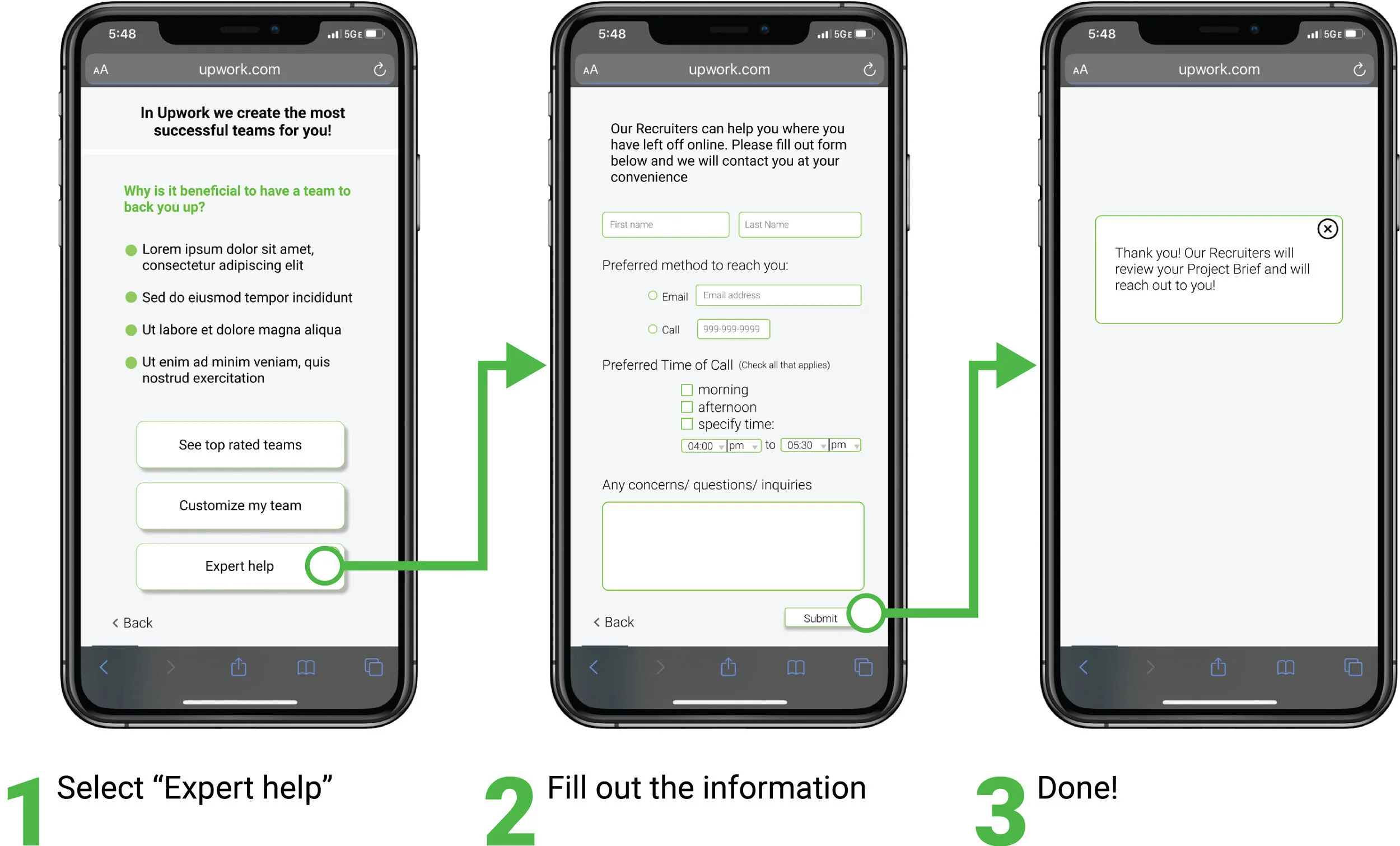
Help Request
If the user is feeling uncertain about how to hire for a project, they can contact Upwork to help guide them through the hiring process.

Final Concept Usability Tests
To test the effectiveness of out final concept and to uncover areas of improvement we ran usability tests with 15 different users through maze.design, an online testing platform. We assigned users two tasks and analyzed the results.

Task 1: Hire a Recommended Team
Results
Testers got lost on two steps: selecting the type of project (45% of testers lost) and on selecting a team to hire (100% of testers lost). Click map on right shows that users clicked on several different areas in an attempt to proceed.
Problem
Ambiguity on where to tap in order to complete the step.
Potential Solution
Progress indicator to show which step the user is on.
Better labeling of icons to remove any ambiguity about function.
Task 2: Customize a team for a mobile development project
Results
During the step of adding freelancers to a team, there was a 60% misclick rate and 80% of users got lost. Click map shows uncertainty on where to click to proceed.
Problem
No obvious call-to-action on how to add freelancers to a team.
Proposed Solutions
Replace plus sign with an “add to team” button.
Enable users to add a freelancer to a comparison chart to before deciding to hire or not.

Takeaways & Next Steps
My first time working as a UX designer with an actual client was a very educational as well as an exhilarating experience! Working with an actual client motivated me to be as professional and responsible as possible, and knowing that I was able to successfully deliver a project to a client like Upwork is a big confidence booster. After this experience I feel capable of taking on any professional challenge as a UX designer.
